Use the Timeline pane to visualize metrics over time at either the thread level or platform level and identify patterns, anomalies, and trends in the data.
You can hover, zoom-in, and filter the data at interesting points in time to get more detail. Typically the Timeline pane is located at the bottom of the window but for the views focused on the metrics distribution over time, it may occupy the upper or central part of the window. Data presented in the Timeline pane varies depending on the analysis type and viewpoint.
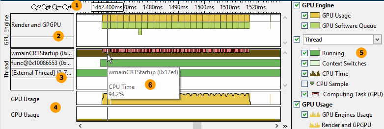
The Timeline pane typically provides the following data:
|
Toolbar. Navigation control to zoom in/out the view on areas of interest. For more details on the Timeline controls, see Managing Timeline View topic. |
|
Platform metrics. Depending on the analysis type, the Timeline pane may present several areas with platform specific metrics such as GPU engine usage, computing queue for OpenCL™ applications, bandwidth data, power consumption, and so on. The most detailed analysis of the platform metrics is available with the Timeline pane in the Platform window. |
|
Application metrics per grouping level. Depending on the viewpoint, the data may be represented by threads, modules, processes, cores, packages, and other units monitored by the data collector during the analysis run. For most of the viewpoints, the Thread grouping is default. For some viewpoints, you may change the grouping level using the drop-down menu in the Legend area. Note that the CPU Time metric value provided in the Thread area is applicable to a particular thread where 100% is the maximum possible utilization for a thread. For example, for the selection above 94.2% of CPU Time utilization means that the thread was active 94.2% of time and 5.8% it was waiting. |
|
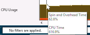
Selected metrics. Data on the most representative metrics may be presented as separate rows demonstrating an overall application performance over time (for example, CPU Usage or GPU HW metrics) or system-wide execution (for example, GPU Usage). See Reference for Performance Metrics for detailed metrics description. Note that the CPU Usage metric in the Timeline pane is calculated as a sum of CPU time per each thread where 100% is the maximum possible utilization per CPU. For example, at the moment selected in the picture below the application utilized 6.16 of logical CPU cores (if every CPU is 100%, then 616% is 6.16) out of 8, and 0,6 of CPU was used by the application threads for overhead or spinning. This means that the application utilized only 5.56 of CPUs effectively.
|
|
Legend. Types of data presented on the timeline. Filter in/out any type of data presented in the timeline by selecting/deselecting corresponding check boxes. The list of performance metrics presented in the view depend on the selected analysis type and viewpoint. VTune Amplifier also uses special indicators to classify the presented data on the timeline:
|
|
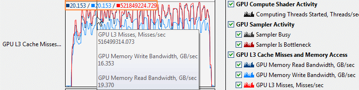
Tooltips. Hover over a chart element to get statistics on this metric/program unit for the selected moment of time. |


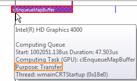
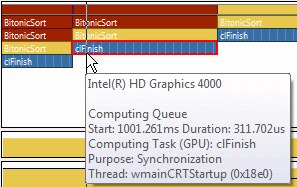
 Markers. Color markers indicate an area on the timeline when a particular task/ frame/event/etc. was executed. Hover over a marker to see the execution details for the selected element. The following markers are available:

For the GPU analysis of applications using OpenCL software technology, the Timeline pane in the Graphics window provides the following tabs:
Platform tab that focuses on a per-thread and per-process distribution of the CPU and GPU hardware metrics collected during the analysis run.
Architecture Diagram tab that is provided for OpenCL application analysis collected with the Analyze Processor Graphics hardware events option on systems with Intel® HD Graphics and Intel® Iris® Graphics. This tabs helps better understand the distribution of the GPU hardware metrics per architecture blocks for the period the selected OpenCL kernel was running.
Note
Collecting energy analysis data with Intel® SoC Watch is available for target Android*, Windows*, or Linux* devices and provided only with the Intel System Studio. Import and viewing of the Intel SoC Watch results is supported with any version of the VTune Amplifier.